BOXPLOTS or ‘box-and-whisker’ plots
I will try to explain what the boxplot, a visual summary, or graphic visualisation of data, means by showing actual data.

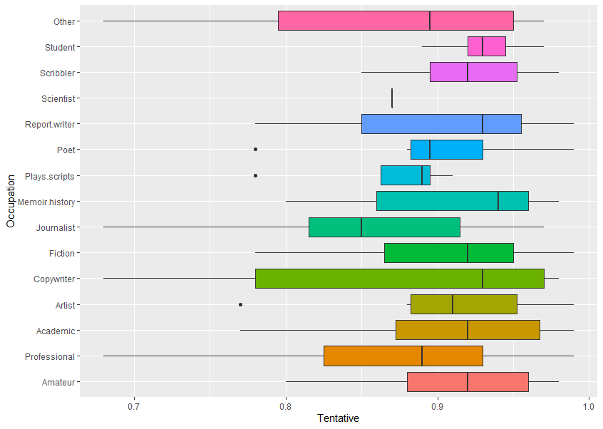
Occupation vs TentativeThis plots data for Occupation (eg, Other, Student, Scribbler, etc) against Sentiment scores for the emotion Tentative (using text analysis of their written feedback).
Looking at all of the different things on the boxplot, you can see:
-
- a coloured (usually)
box
-
- or
rectangle
-
- a
vertical line
-
- somewhere in the middle of the box
-
- horizontal
lines
-
- (but not always) coming out left and right
dot
-
- or dots (but not always) on the same level but not on the lines
-
- the data might show as just
one vertical line
- .
Boxplots show:
-
- many features of the raw data in a simple way, and
- the distribution of a continuous variable.
The box edges to left and right are also called hinges. The vertical line in the middle is the median value (middle value of all the numbers). The horizontal lines are also called whiskers. (This is the Tukey method, see references at bottom.)
The boxplot shows five summary statistics:
-
- the median
-
- two hinges or edges of the box, the quartiles
-
- with up to two lines or whiskers, showing the other quartiles
-
- and all outlying (outlier) points individually as dots
- any consequently, skewing of data from a symmetrical normal distribution
Example
Now we will look at how one of these graphics is made from the raw data.
If you look at one of the horizontal graphics for occupation – Poet (sixth down):

Raw data and graphic explanation
First the numbers are sorted (ranked). Look at this breakdown, below, of where the numbers are in relation to the median (middle) value, and then how this related to the boxplot.
The data is the score on the sentiment analyser for tentative-related words, higher means more, score can be 0 to 1.0.

Other cases
The one below has just a single line instead of a box, because there is only one data point (0.87) – so you can get a gappy-looking boxplot, that is OK.
![]()
Notes
A boxplot helps to visualise the distribution of the data by quartile and show any outliers.
The plot above visualises five summary statistics, the median, two hinges or edges, and two whiskers or lines, and all outlier points individually as dots.
The box (coloured rectangle) always extends from the 25th to 75th percentiles. These sometimes called the ‘hinges’ of the plot.
The line in the middle of the box is plotted at the median.
Quartile: a type of quantile which divides the number of data points into four more or less equal parts, or quarters.
Quantile: in statistics and probability, quantiles are cut points dividing the range of a probability distribution into continuous intervals with equal probabilities, or dividing the observations in a sample in the same way.
Outliers: examination of the data for observations that are far removed from the mass of data (which could be for unrelated or distracting issues, or not).
Practical note: In the boxplot above, the data (which is from the experiment, saved as CSV files, and then imported into Excel for data cleaning (tidying up gaps etc. from the CSV format). From Excel it is then used in R statistical package.
References
General statistics calculators (great sites)
https://www.socscistatistics.com/tests/mannwhitney/
https://goodcalculators.com/statistics-calculators/
Boxplots (this is the best introduction)
Wiki
https://en.wikipedia.org/wiki/Box_plot
R and boxplots
https://www.statmethods.net/graphs/boxplot.html
The box and whiskers plot was first introduced in 1970 by John Tukey, who later published on the subject in 1977.
John W. Tukey (1977). Exploratory Data Analysis. Addison-Wesley.
