ANNA RIDLER – Artist
All material is copyright Anna Ridler, all rights reserved. The Computer Arts Society CAS talk AI & Image Art, 1 June 2023. For the full video please visit the CAS Talks page
Visit Anna Ridler’s website
It was really interesting hearing both of your talks [Geoff and Luba], and especially it’s always a pleasure to speak after Luba because, as she mentioned, we have been working together quite closely for the past five, six, seven years has it been? And it’s been really interesting to see how the space has evolved in that time, especially now with the recent advancements in these diffusion models and the text to image models. I’m most well known for my Tulip projects, which I will talk about. But I did also want to which I made using Gans. I want to touch on how the field has changed, because now when you talk about AI art, it does now have, I think, like if you go on Twitter or if you go on Discord, it very much is being used to refer to a very particular type of work, which is this text to image work. What I’m showing now is just some very quick examples of Dall-E Tulips that I made. I was actually very lucky, and I was one of the first people to get access to Dall-E back when it was released.
And I found it actually really difficult to make work with. And it’s taken me a long time to get my hands into things like stable diffusion and Daly and mid journey to make work with because I find that the way that it’s structured and the way that it’s designed, particularly with Daly, I found it really you have no access to the code base. You have no access to the data set. There’s no way that you can tinker with it. And you’re very reliant on an API and everything is closed off. So as an artist who’s very interested in the tools and the means of production, I found it very difficult to get into and work with. I mean, that is changing. I still think there are conceptually interesting things that you can do with it. There’s really interesting research that is coming out around how it relates to memory and how it relates to and you can do some interesting things around language and ontology, but because for the most part, it’s locked away. And even when you’re working with stable diffusion, I find that you can’t look through all of the data and you can fine tune it, but you’re always going to be working off the base of the like the massive lion data set.
But for me, it’s been a long time to get to a place where I think I can do something with it. And that being said, there’s so much being produced every day with it. It does feel like magic when you play with it. I remember the first time I typed something in and got these images out. It did feel so incredible to get it. But it does raise this real question about kind of, I think, what art is, because not every image is necessarily art. And I think that’s a debate that is now going on because so much is being produced and there is this question about where does the art sit? And I think for me, the art is very much like how it’s then displayed or the message that it contains and the experience that someone has through interacting with it. So, as Liber mentioned, I’m most well known for my data sets, the work that I do with data sets. And this isn’t something that is just explicitly linked with machine learning. It’s something that I’ve worked with for a much longer period of time.
I’ve always been interested in archives and libraries and data and information because for me, like every piece of data, every piece of information is a trace of something that once existed. In many ways, I feel like reconstructing that data or that data set is like a very human thing to do work almost like a detective building up these bits of data to produce an idea or a story or to use it in my project. I think there are lots of interesting parallels between encyclopaedias and dictionaries and the history of those with some of the issues around machine learning and data sets that I’ve explored. This project that I showed in the previous slide, and it’s playing now, which was commissioned by the Photographers Gallery, where I essentially created my own ImageNet using Victorian and Edwardian encyclopaedias. I think one of the things that’s also really important for me and part of my practice is showcasing the labor that goes into these projects and the way of working so it’s not just for me like the final output.
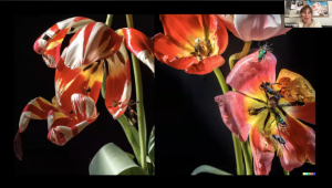
It’s also how I got to that output. And so a lot of the time, I will document the process of making, and that documentation will be equally as important part of the final project as the artefact. That’s something that I come to you again and again in my work project that Luba commissioned me to make back in 2017. It was a project that really took off for me, actually, which is about Chileps, where I created a piece using a GAN. It was a Singan back then, the first one, which I trained on 10,000 images of tulips that I took myself. I didn’t make the tulips myself. I was in the Netherlands at the time working. And one of the reasons why I was really interested in tulips was I was making a comparison between Chulip Mania this was the first no speculative bubble and bitcoin and also the bubble that was going on around AI at the time. So in the gan piece shall show in a bit. The gan is controlled, the price of bitcoin. And it was a really important project for me to do.
And I spent a lot of time building this data set. And it’s you have a very different relationship to the data when you’re when you’re working with it very physically. Carrying all of these tulips was very heavy. Stripping them was very heavy. And one of the reasons why I stopped at 10,000 tulips wasn’t because it’s a very nice round number, although it is it’s because tulip season ended. So even though this was a very digital project, it was driven by the rhythms of nature. After I took these, if I can go to the next slide. After I took all of these photographs, I really wanted to display the data as an artwork in and of itself, which led to a separate piece called Myriad, where I’ve taken the photographs and showed them with some of the labels that I attached to them handwritten underneath. And for me, it was part of the way to draw the attention to all of the human decision making that sits somewhere in the chain of AI. Because at the time that this was being shown back in 2018, there wasn’t yet that discussion and bias around how human, Eric can creep into these systems.
This piece, when it was shown, and you can see on some of them that you can see my handwriting where I’ve crossed things out. And the piece, when it’s shown, is huge, and it’s around 50 m². It’s only been shown its entirety twice because you need quite a large space to put it up in. And I think it also gives people a real sense of the scale of data, because 10,000, when you scroll through on a thumb drive, you don’t really understand what that means in the way that you do when your body is physically reacting to it. So it takes a long time to walk by all of these photographs, and you get a sense of how long the process of putting it all together was and the labor, effort, energy and all of those things that sits behind creating a data set. Another reference point for this project was very much the Dutch still life, like the Golden Age Dutch painter, very heavily referenced in how I composed my data set, which is also another reason why I really like doing things myself.
You can’t well, I suppose you can now with like tools like stable diffusion and things. But at the time, you can create a data set of you can Google and ask for 10,000 images of Tulips against a black background. And one of the things that I really liked about the further comparison that I liked about like these Dutch steel lifes and the way that Gans work is that these paintings, the flowers in them can all exist at once. They’re flowers from spring and summer and autumn and winter that are combined. So they’re botanical impossibilities, these bouquets. But they’re combined using all of the fragments that the artist has got of the flowers that he’s seen, sketches and memories and things like that. So rather than copying from nature, paintings are drawing in from the experience of the painter. And for me, that’s a really nice parallel to how gowns work. They’re not merely copying images from the data set and collaging them together, but creating an imagined botanical possibility through the knowledge that it’s gained through the data set.
So I think there’s, like, that nice parallel that exists there. The other reference that I like to bring out with this project is the history of floral data sets that sit inside machine learning. This is the Iris data set, which is inside psychic learn. So every time that you’re importing that into a piece of code, you’re also importing the Iris data set, which was something that it was a data set created by Ronald Fisher, which has all this different data about Irises. So there is this history, this hidden history inside machine learning of Laurel data sets, which is also something that I quite like in this project. The final piece. This is a later made two versions of it. This is the 2019 edition that I made after StyleGAN was released. It’s three screen installation. And as I mentioned, the tulips are controlled by the price of Bitcoin becoming more stripy and open as the price goes up. The title references the disease that gives Tulips their stripes, which was also made them the most valuable at the height of Tulip mania.
And it’s asking questions around value and around notions of value and like speculation and collapsing these two different moments in history. And what I also really enjoyed about this project, because it is a very complicated project, was that through working with the data set and with the Gan, I was able to explore very different things in each part of it. So the data set piece was much more explicitly about machine learning and about the issues and ethics that maybe sit inside of it. Whereas the Gan piece was much more talking about something not really related to the technology and about like wider questions around value and notions of like speculation. I said, it’s a work that still gets exhibited quite regularly in various different variety of different institutions and cultural spaces everywhere. From like public it was on like buses in a town in Germany, just as a very pretty, moving image piece through to critical overviews as to where photography is going in different museums. And then because I know we don’t have masses amount of time, I just wanted to end with something that I often end talks that I do where I often am asked about where I see like AI art sitting.
And I can only answer for myself because I’m not a curator. But I find that I look back into history to see where it might go and I find it hard to connect to some of the early algorithmic artists. But I find it very easy to see the parallels between my practice and land and environmental artists. And I often look to them for inspiration, because land and environmental art is so much about planning. It’s so much about thinking through like all the various different possibilities and then allowing something that you can predict but you can never control, to then act on that planning. And for me, that’s the same as spending all of this time building my data set. All of this time like constructing like a model and then like pressing go and then allowing something to come out of it. And then also like there is this question about where the art sets. And in London Environmental Artists, a lot of it is in the documentation. I think for AI artists it’s also the documentation.
It’s not necessarily like the model as it runs or like the insides of what’s going on it’s the images, it’s the sound, it’s the performance that comes out of it. And so, yeah, that’s like where I wanted to end it and how even like now, I’m still amazed at the possibilities that this technology can offer and how inspirational I find out on a daily basis.