Stats explanation – boxplots

BOXPLOTS or ‘box-and-whisker’ plots

Go to Index of AI research

I will try to explain what the boxplot, a visual summary, or graphic visualisation of data, means by showing actual data.

Occupation vs Tentative

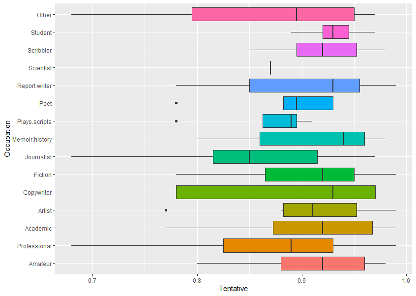
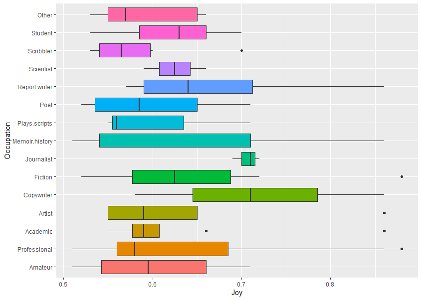
Occupation vs TentativeThis plots data for Occupation (eg, Other, Student, Scribbler, etc) against Sentiment scores for the emotion Tentative (using text analysis of their written feedback).

Looking at all of the different things on the boxplot, you can see:

    • a coloured (usually)

box

    • or

rectangle

    • a

vertical line

    • somewhere in the middle of the box


    • horizontal

lines

    • (but not always) coming out left and right

dot

    • or dots (but not always) on the same level but not on the lines


    • the data might show as just

one vertical line

    .

Boxplots show:

    • many features of the raw data in a simple way, and


    the distribution of a continuous variable.

The box edges to left and right are also called hinges. The vertical line in the middle is the median value (middle value of all the numbers). The horizontal lines are also called whiskers. (This is the Tukey method, see references at bottom.)

The boxplot shows five summary statistics:

    • the median


    • two hinges or edges of the box, the quartiles


    • with up to two lines or whiskers, showing the other quartiles


    • and all outlying (outlier) points individually as dots


    any consequently, skewing of data from a symmetrical normal distribution

Example
Now we will look at how one of these graphics is made from the raw data.

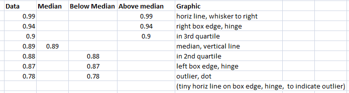
If you look at one of the horizontal graphics for occupation – Poet (sixth down):

Poet data Tentative boxplot

Raw data and graphic explanation
First the numbers are sorted (ranked). Look at this breakdown, below, of where the numbers are in relation to the median (middle) value, and then how this related to the boxplot.
The data is the score on the sentiment analyser for tentative-related words, higher means more, score can be 0 to 1.0.

Data poet tentative explanation

Other cases

The one below has just a single line instead of a box, because there is only one data point (0.87) – so you can get a gappy-looking boxplot, that is OK.

tentative-scientist


Notes

A boxplot helps to visualise the distribution of the data by quartile and show any outliers.

The plot above visualises five summary statistics, the median, two hinges or edges, and two whiskers or lines, and all outlier points individually as dots.

The box (coloured rectangle) always extends from the 25th to 75th percentiles. These sometimes called the ‘hinges’ of the plot.

The line in the middle of the box is plotted at the median.

Quartile: a type of quantile which divides the number of data points into four more or less equal parts, or quarters.

Quantile: in statistics and probability, quantiles are cut points dividing the range of a probability distribution into continuous intervals with equal probabilities, or dividing the observations in a sample in the same way.

Outliers: examination of the data for observations that are far removed from the mass of data (which could be for unrelated or distracting issues, or not).

Practical note: In the boxplot above, the data (which is from the experiment, saved as CSV files, and then imported into Excel for data cleaning (tidying up gaps etc. from the CSV format). From Excel it is then used in R statistical package.

References

General statistics calculators (great sites)

https://www.socscistatistics.com/tests/mannwhitney/

https://goodcalculators.com/statistics-calculators/

Boxplots (this is the best introduction)

Box Plot Explained: Interpretation, Examples, & Comparison

Wiki
https://en.wikipedia.org/wiki/Box_plot
R and boxplots
https://www.statmethods.net/graphs/boxplot.html

The box and whiskers plot was first introduced in 1970 by John Tukey, who later published on the subject in 1977.
John W. Tukey (1977). Exploratory Data Analysis. Addison-Wesley.

Writing occupation and emotions in text generation

In August 2020 research (UAL, see credits) I examined what would happen if and when writers use a computer text generator to write articles, giving them only an image prompt. The idea was to only use professional or serious amateur writers.

Go to Index of AI research

Joy, Fear, Anger, Sadness – emotion charts are after this introduction.

Can text generation help the human writing process? What do actual writers (the study respondents) think of it all?

The research examines creative and ethical concerns around the use of advanced systems, and how they will (or already do) affect stakeholders, both professional writers and serious amateurs.
Here’s the prompt image:

Prompt image man and dog

The results are in but I am still writing it up. So I am now dropping a few things on this blog. These are not the final results as many qualifiers need to be added, statistical definitions, significance, etc. There are over 50 charts, which is why the report is taking a long time.

More about boxplots: This is a blog about some study results boxplots. if you are not sure what it all means, please look at this first.

One question asked was whether they’d used a text generator before, someone replied ‘my unconscious’. 89% had never used a text generator before.

82 respondents from my own creativity writing app list (see below), and various professional bodies.

These are Occupation (type of writer eg, Student, Poet, Journalist etc. – see the left axis);
plotted against amount of Emotion (joy, anger etc.) in their written feedback to all the questions (summed, then scored using a sentiment analyser). (Amateur and Professional are not attached to the actual occupation, so they are on here too.)

Increased emotion values towards the right side of the chart. These plots show ranges so they only give a general visualisation.

Joy

So in the boxplot below, the most joy in responses came from Copywriters.

Perhaps they see a fantastic tool to very quickly make more copy.

Joy vs Occupation
Joy vs Occupation

Fear

The most fear in responses came from Poets and Fiction writers. Perhaps fear of losing their respect as creators of strange new worlds were no one has gone before. Or they see a fantastic tool to very quickly make them unemployed. Other and Scribbler also score on this emotion.

Fear vs Occupation
Fear vs Occupation

Anger

Would appear that Others and Scribblers are somewhat angry about something or other. More research needed! Poet and Fiction also score highly, one each here (a line).

Anger vs Occupation
Anger vs Occupation

Sadness

Perhaps poets know more sad words.

Sadness vs Occupation

There’s lots more charts but that will do for today. The actual stats with significance, etc., are for future viewing.

One of the simple charts:
Time Average on Study by Occupation

Graph- Time Rank Occupations

Game writers had 2 outliers, one person was on it for hours. Perhaps text generation is familiar to games content writers as some games have generated scenarios. Or they have a lot of spare time – to play games.

(Possibly) confirms rumour that songs are written quickly, and that lyricists and poets have flashes of inspiration quickly recorded (and so do copywriters and scientists). Or they were in a hurry to get away…
Game and Songs, Lyrics were added by people within Other definition.

Next blog – the text generation itself.
In the experiment, people were advised to use the generator to make completed works. Several people put my name in the generator, so I became the protagonist in the stories. What!

Such as this Fiction entry:
“It was nice to hear from Geoff again. He is a reminder that life is like an ant’s journey on a blade of grass across a puddle. There is no other side to reach, because the ant is surrounded on all sides. Like an ant, like all of us, Geoff has strategies for paddling. One admires only the paddling, and not especially the termination of the journey. And perhaps that’s what should be the focus of our lives: the paddling. Not journey, not the conclusion, but the sheer determination of the paddling. With a surfer, this analogy would not work, but thinking about it, ants can’t surf.”


People used the OpenAI GPT-2 text generator in a two panel design. I’m releasing this setup as a free AI text editor soon. The generator version is Text Synth by Fabrice Bellard, who is very helpful.

University of the Arts London: my tutor at UAL CCI is Professor Mick Grierson. See Credits (new window). My app is Notes Story Board, an image and text zooming canvas.